Thursday, February 6, 2014

Naive-ish physics

No Wheelcolliders here. Unlike in the early builds I am using Unity's built-in physics here. As before the terrain types are detected with raycasts. The player is locked to a single plane using position and rotation constraints. The damping of the player's rigidbody, and an input force modifier, are adjusted in response to the terrain type. Here the dot is struggling on ice.

Saturday, January 25, 2014

Steering, skidding and avoiding spin-out

Richard and I talked about the possibility of having the handling of the dots feel more 'car' like, and wondered whether that would make things more fun. More skidding and steering.

I've been fiddling with Unity's wheel colliders to see how feasible this would be. In case you didn't come across these before, they're a special kind of physics-enabled object that have independent friction curves for forward (rolling) and lateral (skidding) movement. Wheel colliders also have steeringAngle and motorTorque properties to quickly get them behaving as you'd want when building some kind of vehicle.

I've based my 'dot' controller here on a stripped-down version of the futuristic sports car controller in Unity's new Sample Assets package.

The first problem I noticed is that it was very easy to get into an uncontrolled spin, which wasn't much fun. There ought to be plenty of skidding round corners, but very little spinning.

While googling spin-out I found this wikipedia article

in a car with a short wheelbase, the short lever arm from the CM to the rear wheel will result in a greater lateral force on the rear tire which means greater acceleration and less time for the driver to adjust and prevent a spin out or worse.

Sure enough lengthening the wheelbase helped a great deal.

Monday, September 9, 2013

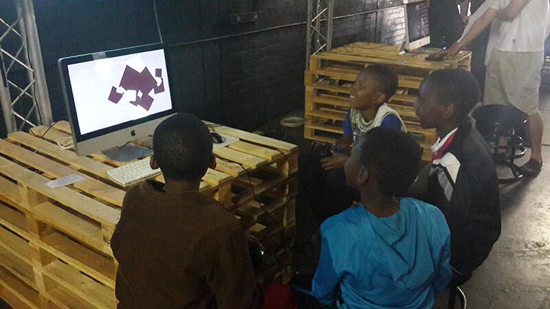
A MAZE. Johannesburg

It's such a nice feeling when the young folk appreciate your game. Here's Chalo Chalo being played during A MAZE. Johannesburg. via Peter Gardener on Twitter.

Saturday, July 20, 2013

Wednesday, April 24, 2013

Chalo Chalo at A MAZE

Chalo Chalo will be playable in Berlin on April 25th 2013 (tomorrow) as part of Local Multiplayer Picnic at the A MAZE indie connect festival.

The site describes the game thus:

CHALO CHALO by Richard Boeser and Tomasz Kaye. If you hear people shouting while seeing dots move slowly, they are probably playing Chalo Chalo, one of the most nail-bitingly intense racing games. Random tracks and upgrades are mixed together with extremely tight, minimalist design to make sure every single race turns out completely different.

Sunday, November 25, 2012

Experiments with isocron maps

We're interested in ways of mapping race information in the post-race display. One way of doing that it to use isocron maps. The idea is that a curve is drawn that connects the positions that all players were in at a given moment. Using a series of these lines, you can get a sense of how the relative distances between players changed over the course of the race. Right now there are loops appearing, and other weird things that aren't quite right. Looks pretty though.

Friday, November 9, 2012

Frogs and lotuses

The latest build of Chalo Chalo will be playable at Copenhagen's first Local Multiplayer Picnic on November the 18th, and at the Versus event in WORM, Rotterdam on the 24th of November.

To business: Between races, Chalo Chalo players get to see their scores. Up until now, the scores have been indicated by solid blocks of colour. Something like this:


The trouble is that players can have negative scores (losing a race loses you one point), but the scheme above doesn't display any score below zero. One solution we've been talking about is to use a special symbol to indicate negative points. I've been fiddling with this approach. Visually, as soon as a symbol was introduced to indicate negative points a couple more problems became apparent: the positive point indicators were less interesting to look at than the negative indicators, and the discrepancy between abstract and representative indicators was annoying. Here's the work in progress as it stands now, using icons for both negative and positive icons. A lotus flower for positive, the frog for negative.
I'm not happy with it yet. I don't like the tension between the icons and the rectangles they inhabit. The grid of rectangles, on its own, divides up and 'activates' the screen space in a pleasing way, while the irregular outlines of the icons work to deny that grid. The two tendencies are battling with each other too much at the moment. Also, the dark, but coloured, backgrounds of the 'inhabited' rectangles are too similar in tone to the uninhabited squares, making the image feel fiddly.
That's a bit better.